FORM DESIGN FOR THE AUSTIN PUBLIC LIBRARY
ASSIGNMENT
Increase new cardholder and renewal conversion rates without sacrificing users’ understanding of library card requirements.
ROLE
Lead UX Designer and UX Researcher
CLIENT
Austin Public Library


I redesigned the Austin Public Library’s card application by streamlining five separate forms into one, incorporating conditional logic, a clearer hierarchy, conversational headings, and grouping of similar user inputs. After testing with ten participants, the new design reduced time on task by 32% on mobile and 14% on desktop, while boosting completion rates by up to 31%.
The Austin Public Library (APL) is an award-winning pillar of the Austin community. The APL system spans 20 branches across Austin, serving over 300,000 customers.
I got involved with the library while studying UX Design at Austin Community College. My team and I restructured the navigation for an updated website launched in 2023. I’ve continued to volunteer as a UX designer.
Improving the library card application experience and increasing cardholders is crucial for the funding of the Austin Public Library system. More cardholders means more funding.
Austin’s city services IT team requires updating some of the Library’s developmental technology, some of which was used to build the application.
To get this project started, I mapped out all possible journeys the applicant could take to apply for a library card. Starting from the homepage, I found an illustration with text just below that reads Get a Library Card. I clicked it and moved to a page dense with text, and gave up reading it beyond the information I’m looking for: How do I get a library card?

The top of the page presented steps to get a library, along with three buttons, each with its respective call to action (CTA): apply for a library card, renew library card/eCard, and apply for an eCard.
Five flows branched from these buttons: adult and youth library card, eCard, renewal, and password reset. Each button led me to another page reiterating the steps to obtain a card from the previous page. I skimmed the text again, in case I missed anything. Below this text, a dropdown offered a list of 1–2 age groups, depending on the card type CTA chosen.

All three entry pages shared a similar introductory page, with copied/pasted text to remind me how to get a card.
The application for a new library card and eCard is laid out the same way. While on a desktop, the application lacked a clear visual hierarchy and employed a multi-column layout. The multiple columns caused me to lose my place in the form, rendering the chunking of information ineffective.

All but four field labels are marked with an asterisk. I wasn’t sure what this indicated until I skimmed through the application and realized that most of the labels have an asterisk, which likely signifies that they are required.
Once the user flows are diagrammed, I ask myself:
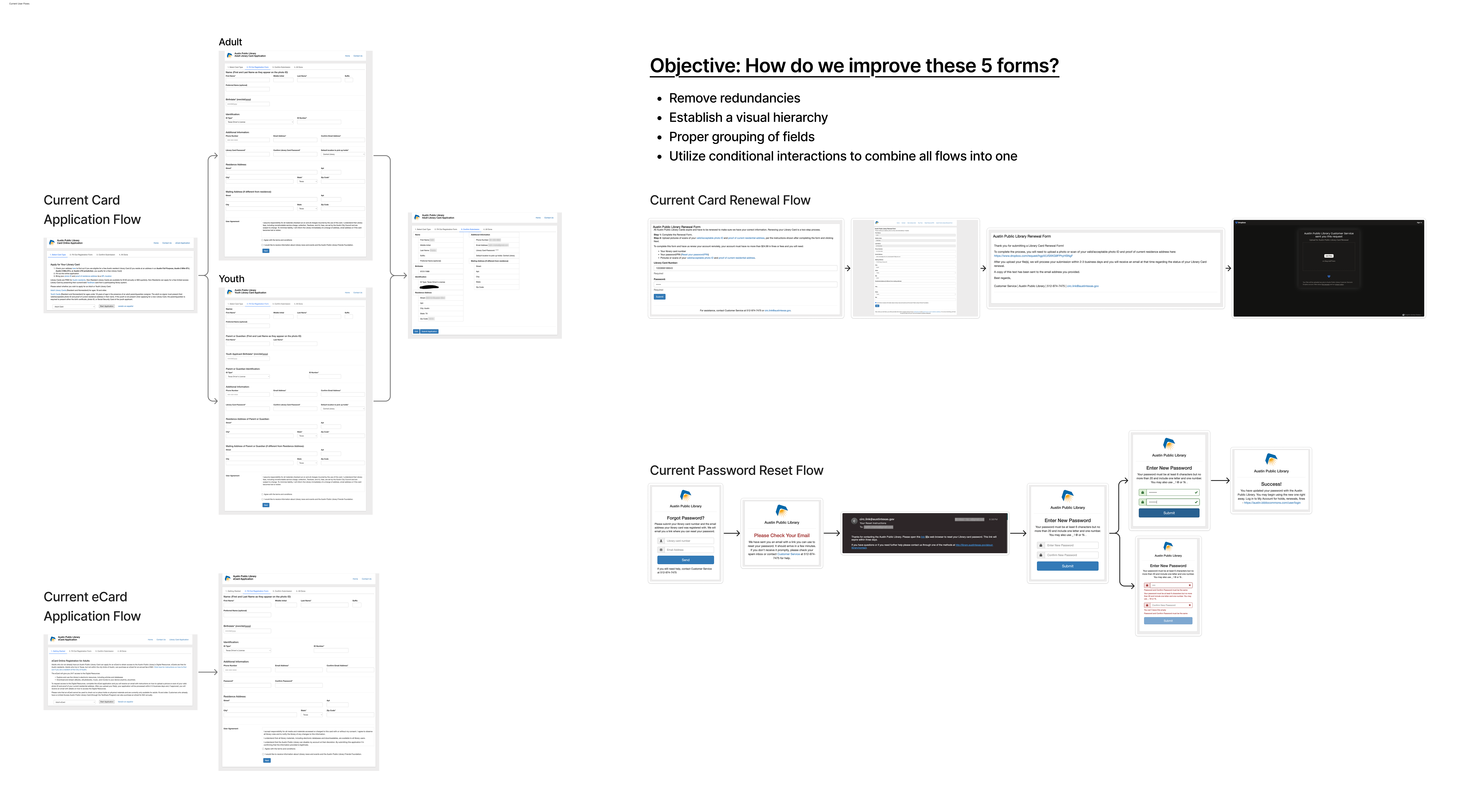
The first thing I cut was the introduction page. Once an applicant clicks the "Apply for a Library Card" CTA, they should begin the application and not have to read information they have likely already processed before this page.
Given that the form has 24 inputs, I decided that a multi-step form with a progress bar would be the most effective way to group similar fields and reduce form abandonment.

Conversational questions are used as headings. This gave a little character to the form and established a visual hierarchy.
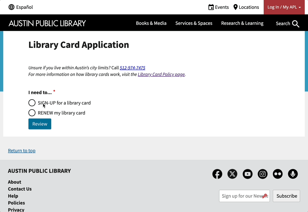
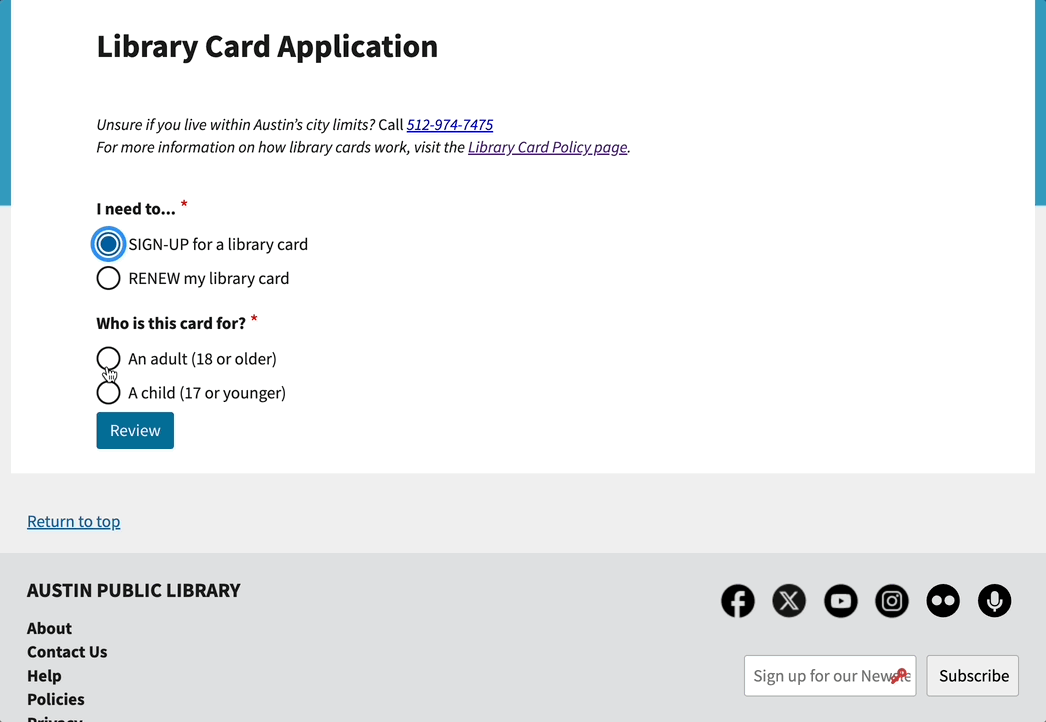
The first two questions would be: “Are you renewing your library card?” and “What type of card do you need?” These questions would effectively streamline all flows into one, removing the need for three CTA’s from the first page.
And of course, there would need to be multiple points to edit inputs from the review page. This allows easy access to any incorrect information and speeds up submissions.
The main feedback I received from my PM, developers, and the library card page content owner was:
To understand those limitations, I asked for access to Drupal, the CMS that the library’s website is built on. From the limited access I was given, I discovered more opportunities with the website and its CMS. Unfortunately, those were not in the scope for this project, but my teammate began working on them separately.
Fortunately, Drupal provided a solution for my problem: conditional interactions. This feature enabled me to create a single form with five different paths using “if this selection, then this path” logic embedded in the code.
For example, when the applicant begins the form, they are prompted with the first fork in their flow: I need to… They can choose to either sign up for a new library card or renew their current library card. Either selection reveals very different next steps.
Sticking with the “new library card” path, the applicant is then presented with the second choice in their flow, “Who is this card for?” They can choose either an adult or a child. Again, either selection reveals a different form; however, a caption under the child option lets the applicant know that a parent or guardian is required as a cosigner.
Even though the application needed a redesign, regardless of the user experience, I needed to convince the dev team of my design. The lead engineer didn’t like to iterate on his builds. Not only would A/B testing reveal anything missed in the design, but it would also help convince the engineers that this is how they should build it.
The test covered all user journeys except resetting their password. I asked my two teammates to assist with gathering participants and reviewing recordings of each participant’s test.
From the test, I wanted to learn:
Success would be measured by time on task and the percentage of required tasks completed without errors.

The team recruited ten participants: 4 for mobile testing and 6 for desktop testing. Qualifying participants must reside in Austin, not have an APL library card, not be employed by the city, and must be open to a library card.
Without providing a deadline, there was pressure from outside the design team to present my final designs soon. This, along with the library’s userstesting.com budget and scheduling, led me to use unmoderated testing.
The updated form received a higher qualitative response from participants and increased success rates compared to the current form.
The redesign reduced the average time on task by 32% on mobile devices and 14% on desktops.

From the mobile device testing, the redesign achieved a 31% increase in the library card path, a 25% increase in the eCard path, and 28% increase in the youth card path.

As for the desktop testing, the redesign earned a 28% increase in the library card path, a 25% increase in the eCard path, and a 13% increase in the youth card path.

©2025 Keith Charba. All rights reserved.


©2025 Keith Charba. All rights reserved.


